Member-only story
Logology
How Airbnb’s Logo Brushed Off the Haters and Embodied a Design Trend
The Bélo mark has established itself as the most iconic symbol among those of today’s tech unicorns
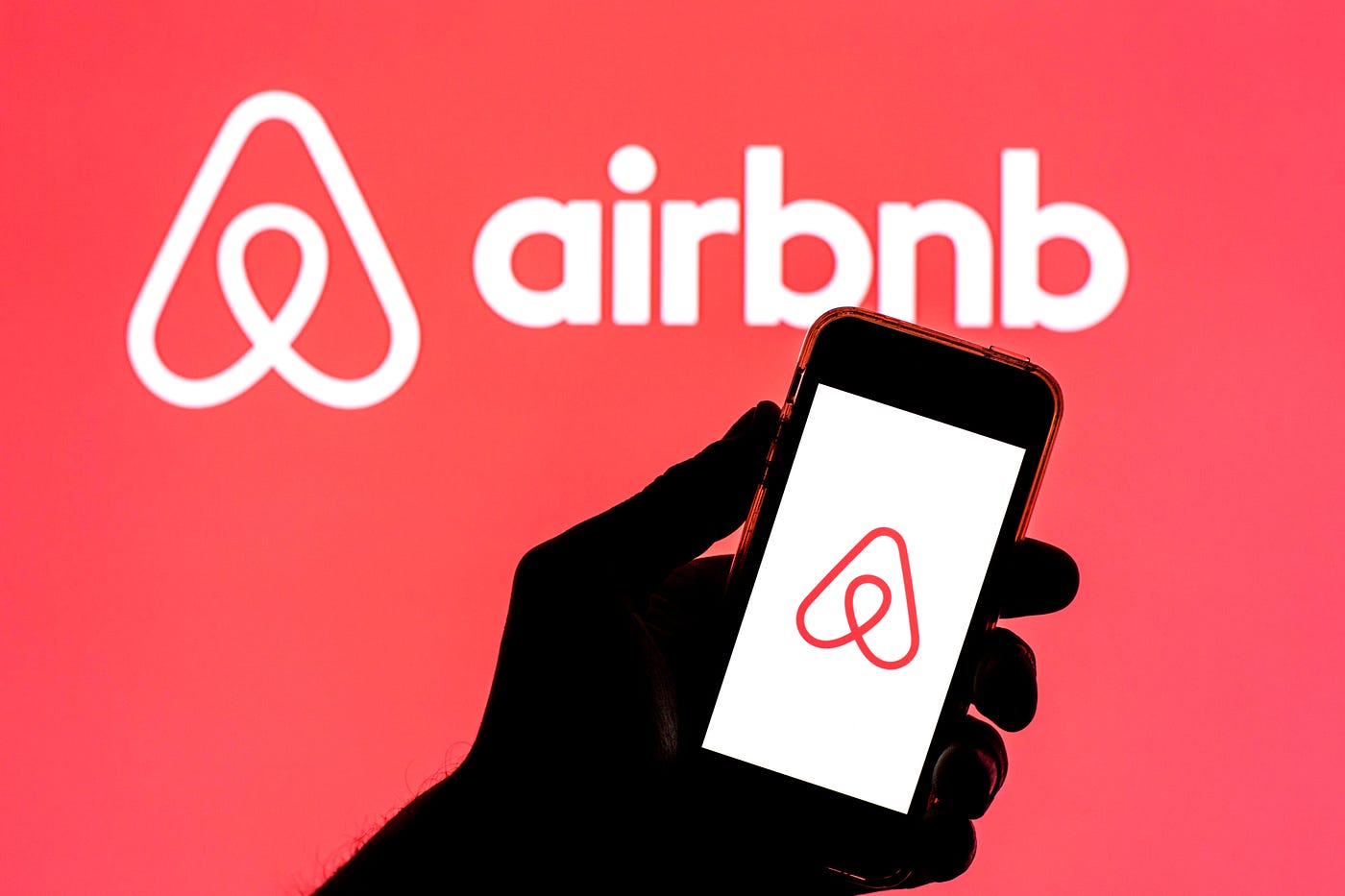
Logos have become popular topics for public discussion in recent years, thanks in large part to the emergence of social media. And in the past decade, perhaps no logo has generated as much online chatter as Airbnb’s 2014 “Bélo” mark, formed by a simple line tracing a triangle, with a loop thrown in at the bottom. DesignStudio, the logo’s creator, helpfully provided an explanation of the symbol, noting how it combined design elements representing people, a heart, a map icon, and a capital “A,” emphasizing the decidedly corny brand proposition that Airbnb was not merely a way to rent a place to stay, but rather was about “belonging.”
But the internet, in an astonishing outpouring of juvenility that would have left even Beavis and Butthead blushing, saw in the Bélo only butts, boobs, and assorted genitalia. While most of these Twitter wiseacres were simply having a laugh, a not insignificant portion of the commentary came from those who honestly seemed to believe that Airbnb had made a company-wrecking mistake in adopting such a scandalous logo.
Seven years later, Airbnb has proven that thinking wrong, having gone public and boasting a $90 billion market cap. Along the way, its noble goal of spreading belonging across the world has taken a backseat to the establishment of a global platform that has resulted in millions of people finding themselves living next door to unregulated mini-hotels and party houses.
Meanwhile, the Bélo survived its initial mockery and has established itself as the most iconic symbol among those of today’s tech unicorns. Its simplicity provides much of its strength, even as it also resulted in the realization that the design had essentially been done before, by IT concern Automation Anywhere and by a Japanese company in 1975.
The little loop at the logo’s heart seems to have become a significant design element in many…

