Member-only story
Logology
How Custom Fonts Became the Ultimate Corporate Flex
Why everyone from Goldman Sachs to Netflix is investing in their very own typeface
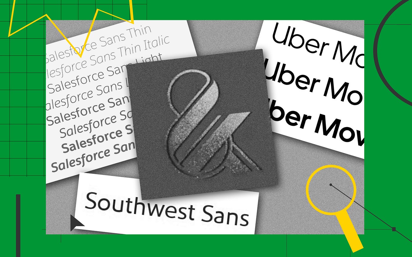
Apparel retailer Banana Republic found itself in hot water last month, accused in a lawsuit filed by New York typographer Moshik Nadav of unlawfully appropriating the ampersand from his Paris Pro typeface. But the attempt to add some sparkle to the clothing retailer’s brand — after a recent rough patch for both Banana Republic and its beleaguered parent, Gap Inc. — fell flat.
The recent appeal of the ampersand is undeniable: Its use in U.S. trademarks is up 31% since 2000. But before purloining Nadav’s ligature, perhaps Banana Republic should have considered a strategy being employed by an increasing number of businesses: commissioning an in-house custom — or “bespoke,” as is today’s vogue — typeface that the company is free to use as it pleases.
The New York Times identified these proprietary fonts as “an increasingly common corporate flex” earlier this year in an examination of Goldman Sachs’ new Goldman Sans typeface, which achieved a brief period of notoriety before a clause in its license prohibiting the use of the font to disparage the oft-maligned investment bank was removed.
A font can serve as a sort of uniform for a firm; its words will always be dressed in the same way, leading to increased brand recognition.
Typeface flexing does seem to be the best way to characterize the recent cascade of companies — Netflix, Airbnb, SAP — announcing their newly acquired typefaces, often with an accompanying website that proudly elaborates the finer details of the letterforms’ apertures, ascenders, and counters. It’s a process of one-upmanship that recalls the scene in American Psycho in which a group of Wall Street bros try to outdo one another with the “raised lettering,” “subtle off-white coloring,” and “tasteful thickness” of their business cards.

