Member-only story
Logology
Replacing Aunt Jemima Is Just the Tip of the Iceberg
A deep dive into America’s long, fraught tradition of racist logos

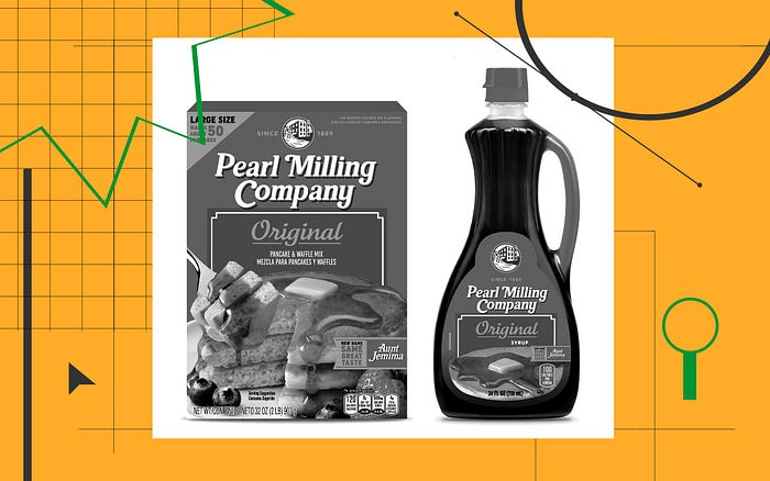
The Black Lives Matter groundswell last year prompted reckonings across many aspects of American business, including branding. The criticism of long-established commercial icons like Aunt Jemima and Uncle Ben’s, which had been building for decades, finally reached a tipping point. The result was their removal from packaging in overdue recognition of their roots in racist stereotypes, and their eventual replacement. So it was announced this week that the Aunt Jemima brand will now be known as “Pearl Milling Company,” replacing the character’s portrait with a drawing of a 19th-century water mill.
Late last year we saw a handful of these brand rehabs: Professional sports franchises stated their plans to abandon team names deemed culturally appropriative and outright offensive as reflected by the Cleveland Indians and the Washington Redskins, now the Washington Football Team. And Land O’Lakes quietly removed its Native American “butter maiden” logo last spring ahead of its 100th anniversary of the brand this year. Beyond inspiring these specific changes, though, the cultural moment has also made distinct the more general difficulty that corporate America faces in depicting itself in a human way.
“Corporations are people, my friend,” Mitt Romney infamously declared during his 2012 presidential run. The negative reaction to his tone-deaf statement highlighted the common perception that business lacks a certain humanity, a viewpoint that is reinforced by looking over today’s corporate branding. The armies of “trade characters” once sent forth by U.S. companies to represent themselves and their products have dwindled to a relative few.
Only eight Fortune 500 logos, or 1.6% of the total, contain a likeness of a person.
Today, only eight Fortune 500 logos, or 1.6% of the total, contain a likeness of a person. Three of them — those of Aramark, Sempra Energy, and WESCO International — employ highly abstract human images, not too far removed from the blank figures found on restroom doors. Two, Franklin Templeton and Lincoln Financial Group…

